UI/UX / how it grew
Interfaces people can use the first time.
I trained in human-centered computing and have spent ten years building screens for real work: field crews on rugged scanners, administrators managing access, and my own finance workspace. Here is how that practice grew.
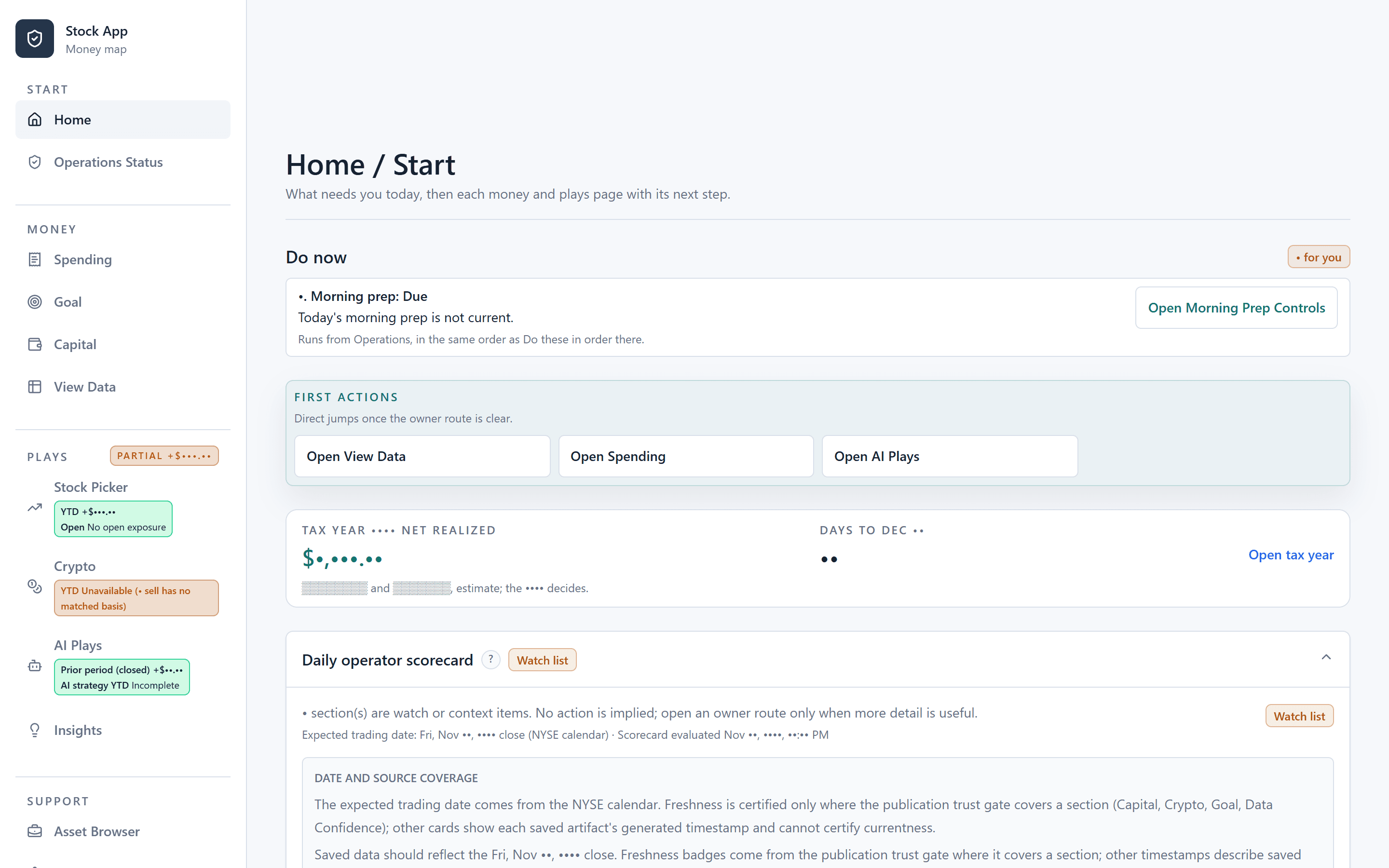
What I hold to
- Start with the next action. Every screen should answer "what do I do now?" before it shows anything else.
- Explain the number. A value with no context is noise. Say what it includes, where it came from, and how fresh it is.
- Design for the hardest setting. If it works on a rugged scanner in a parking lot, it works at a desk.
- Errors people can read. Access-denied pages, empty states, and failures should use plain words, not internal keys.
Growth over the years
Building for the people walking past
Built self-updating campus kiosks that showed news, sports, and weather to students, and placed third in a Microsoft Windows Phone programming competition. My first lesson was that a screen people only glance at has to be clear the first time.
- Glanceable layouts
- Content that keeps itself current
- Mobile-first thinking
Learning to design with people, not for them
Earned an M.S. in Human-Centered Computing. As a research student in the UMBC prototyping and development lab, I designed 3D physical prototypes and ran weekly 3D design and printing workshops for elementary school students to study what the technology could do for them.
- User research
- Physical prototyping
- Workshop facilitation
- Tinkercad and Cura
A full usability study, start to finish
Ran an in-depth usability analysis of the BookFusion reading app across platforms and devices: competitive analysis, personas, user, environmental, and hierarchical task analysis, contextual inquiries and interviews, medium-fidelity prototypes and testing, and eye-tracking studies.
- Competitive analysis
- Personas
- Task analysis
- Contextual inquiry
- Eye-tracking tests
Redesigning a customer app end to end
Redesigned the customer-facing mobile app's whole interface to match the brand. I made the mockups and high-fidelity prototypes used to evaluate new features, ran the user analysis and research behind design reviews, and built the iOS and Android app from specification to release.
- End-to-end mobile redesign
- Mockups and hi-fi prototypes
- User research
- Design reviews
Interfaces for the field and for administrators
Design and build screens for people scanning assets on rugged scanners, phones, and iPads, where gloves, glare, and spotty connections are normal. On the web side, I turned a raw permission model into an admin screen people can use: a permission grid with bulk select, collapsible categories, dependency hints, and readable access-denied messages.
- Field-ready mobile UI
- Jetpack Compose and SwiftUI
- Admin UX
- Readable error states
Making complex data calm
Designed the whole product myself: a home screen that starts with what needs attention today, one clear next step per page, charts that keep actual history visibly separate from projections, and copy that says what each number does and does not include.
- Information hierarchy
- Data visualization
- Explainable UI copy
- Design audits
Design standards an agent can follow
With AI agents writing more of the code, I write the interface rules down: UI contracts, audit checklists, and acceptance criteria an agent can be held to. Then I review the result on screen, at real sizes, before it ships.
- Written UI contracts
- Visual review at real sizes
- Spec-driven UI work